• Skip to primary navigation
  • Skip to main content
  • Skip to primary sidebar
  • Home
  • Archive
  • ABOUT/CONTACT
  • D O N A T E !
  • Subscribe

Squarecylinder.com – Art Reviews | Art Museums | Art Gallery Listings Northern California

Northern California Art

  • Interviews
    • VIDEO
  • News
  • Previews
  • Profiles
  • Reviews
    • Conceptual
    • Drawing
    • Multimedia
    • Painting
    • Photography
    • Sculpture
  • Special Reports
  • Top Stories
  • Venues
    • Art Gallery
    • Art Museum
    • University/College
  • Contributors

Art of the Book @ Cantor Art Center & SVMA

June 29, 2011

Moving Parts Press, "Codex Espanglinesis from Columbus to the Border Patrol", 1998


If you’ve grown accustomed to designing books or brochures or even birthday cards on a PC, you may not fully appreciate the fact that typography and book design were once the province of skilled tradesmen (and women) who wielded industrial hand tools with a pride of purpose that today has practically vanished. For a reminder of what limited-edition fine press publishing looked like in the pre-digital age, The Art of the Book in California: Five Contemporary Presses offers a lively, literary display of book objects – one whose artistry, while not entirely grounded in the realm of fine art, is hardly extinguished or forgotten. Ranging from the downright funny to the poetic, the 50 books on view have a sensual appeal that comes primarily from the sculptural heft imparted by digital design’s progenitor: hand-composed metal type. In an era when the printed word faces extinction, this show feels like an appropriate bit of advocacy in favor of the “book beautiful” in which text comes first. The exhibition is drawn entirely from the extraordinary holdings on art of the book in the Department of Special Collections at Stanford Libraries. It is organized by Guest Curator Peter Rutledge Koch in collaboration with Special Collection’s Roberto Trujillo and the Cantor’s Alison Roth.   In addition, the Sonoma Valley Museum of Art offers a concurrent show of original book art, Rebound, about which I’ll say more later. 

Foolscap Press, "Herakles and Eurystheusian 12-Step Program", 2009
The Cantor exhibition opens with large walls, resembling open books containing images of the printer/proprietors (Foolscap Press, Moving Parts Press, Ninja Press, Turkey Press, and Peter Koch Printer) in their studios. While their outputs differ substantially, their books all demonstrate typographic sophistication, sensitive selection of materials, artistic bindings, intriguing and cohesive design concepts and an acute awareness of printing traditions. But unlike most art museum exhibitions devoted to this subject, which concentrate on one of three areas – livres de peintres (or painters’ books), “book objects” or the landmark books of literary private presses – this show focuses primarily (but not exclusively) on typography while incorporating elements from other traditions. 
 
To put the hybrid nature of these works in perspective, it helps to know a little about their history. In Paris in the early 20th century, livres de peintres emerged as the most important development in the art of the book. In these works, distinguished painters and sculptors illustrated luxuriously produced editions of fine prints for an elite group of collectors. Unfettered by technical demands of printing, or the need to create graphic paraphrases for celebrated texts, artists like Henri Matisse helped forge an unparalleled freedom of expression on the page. (In the Bay Area, Arion Press continues that tradition with books that include illustrations by the likes of Jim Dine, Richard Diebenkorn and Robert Motherwell.)
 
Moving Parts Press, "Documentado/Undocumentado (Relia Box)", work in progress. Courtesy of Felicia Rice
A second genre is the “book object” consisting of avant-garde books or artists’ books. Initially they were constructed, deconstructed, mutilated or expanded into sculpture— or machine printed with cheap materials for larger audiences to question the very nature of the book. Primary vehicles during the Dada era for anti-art expressions, such books, from the 1960s to the present, have functioned as alternate modes of expression for artists with an interest in sequences. (The book, like film, is a time-based media.)
 
A third genre, “landmark books,” for want of another name, offers windows into different cultural eras from the time of Gutenberg forward. The Works of Geoffrey Chaucer (1561), published by William Morris’ Kelmscott Press, is a prime example, and it’s now on view in a concurrent show (Illustrated Title Pages: 1500-1900) also at the Cantor Art Center through October 16.  A scholar of medieval bookmaking and the founder of the Arts and Crafts movement in 19th century England, Morris envisioned an alternative to mass-produced goods of the Industrial Revolution in the “book beautiful.” He revived the hand-press technology and typographical style of the 15th century in books characterized by unified design, handmade papers, pristine clarity and elegant typography.
 
Turkey Press, "The Standard", 1977
The books in Five Contemporary Presses build on these traditions but at the same time expand upon them with the use of digital tools. Books by Carolee Campbell, founder of Ninja Press, are clearly some of this show’s highlights. Perhaps known more widely for her role in the TV soap opera, The Doctors, Campbell, like other printers in the exhibition, designs and prints all her books. Yet she is the only one to exclusively use handset metal type. The results are unique because her work extends into bookbinding, photography, and conceptual organization. In one of her book’s bindings, The Architextures1-7: "The Man of Music,” she torched and patinated thin sheets of brass to encourage a variety of colors to bloom; equally eye-catching is her own photography, seen in the cyanotypes of languorous nudes in XXIV Short Love Poems (2002). Campbell’s 1995 book The Real World of Manuel Córdova, is housed in an accordion-style binding that may be unfolded and read in hand, stanza by stanza, or opened entirely to reveal all 43, 14-line stanzas. Fully extended, the book is a 15- foot river of a page. When placed in its paper enclosure, it reveals a reproduction of the 1665 map drawn by Athanasius Kircher, which first charted the world’s ocean currents. The book’s text, a poem by W.S. Merwin, relays the true story of a Peruvian who was abducted by Amazonian tribes and became a Shamanic healer. A hand-tinted rivulet meanders down the page, as a symbol to enhance the serpentine format of Merwin’s poem on Japanese persimmon paper. Open the book and it emits a sound to match: that of a cascading river, according to Koch, the guest curator.
 
Peter Koch Printers, "The Lost Journals of Sacajawea", 2010
Foolscap Press’ book Direction of the Road (2007) also appeals to the senses.Turn the book’s letterpress-printed “leaves” of Saint Armand paper, and out comes a rustling sound. The text, by Urusula K. Le Guin, reveals a story narrated from an oak tree’s viewpoint. The transparency of the paper on which it’s printed lends a ghostly illusion of leaves falling in the periphery of the text. It’s accompanied by Aaron Johnson’s woodcut, a distorted anamorphic image, which plays havoc with perspective and point of view. When his abstract swirl of a print is reflected onto a standing cylindrical mirror, the new perspective reveals a tree. The purpose of the book, according to Foolscap proprietors Lawrence G. Van Velzer and Peggy Gotthold, is to give readers time to reflect on their surroundings, which we indeed, do.
 
Velzer and Gotthold are both experienced puppeteers, and they include with their book, Herakles and the Eurystheusian Twelve-Step Program (2009), a video performance of their shadow puppets. In it, they recast the Greek myth of Hercules as a strongman dealing with anger management issues. Other Worlds: Journey to the Moon (2004) opens to an image of the moon engraved by Claude Mellan and includes a 17th century text by Cyrano de Bergerac that describes an imaginary flight written to resolve a dispute about the moon’s nature. It also includes etchings by Leslie Lerner depicting a surreal odyssey of the artist’s alter ego. Lerner’s narrative appears in his own series, My Life in France, and its parallel placement in Other Worlds functions as a dislocation to de Bergerac’s text.
 
Foolscap Press, "Other Worlds: Journey to the Moon, 2004
Dislocation also figures prominently in Codex Espangliensis: from Columbus to the Border Patrol (1998), a collaborative work by book artist Felicia Rice, artist Enrique Chagoya and writer/performance artist Guillermo Gómez-Peña.  Published by Rice’s Santa Cruz-based Moving Parts Press, it features Chagoya’s now-familiar cast of comic superheroes colliding with Colonial-era representations of New World natives, the Virgin of Guadalupe and other cultural and religious icons from both sides of the border. These fire-and-brimstone visual rants aim to subvert ethnocentric views towards Mexican Americans that affect policy-making.  It is the third book by in a series that establishes Chicano literature as a major inquiry for Rice’s press. She manages the MFA program in Digital Arts and New Media at UC Santa Cruz and likens the book’s structure to a living body. Type forms the “ligaments and musculature”. Its “skeletal structure” derives from Chagoya’s imagery, and a “living membrane”, with variations in text and color, was created with uneven fibers of handmade Mexican Amate paper and thin tissue. For Rice, the result is a “deeply embossed, richly textured surface that combines the conceptual and theoretical, the political and personal in a cohesive work that transcends its components.” 
Ninja Press, "Burn Down the Zendo", 2004

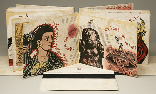
Documentado/Undocumented, a related collaboration with writer and performance artist Guillermo Gómez-Peña, is an accordion-folded, codex book with a text accompanied by a performance DVD. It includes contributions by filmmaker Gustavo Vasquez and art critic Jennifer Gonzalez, with soundscapes by Zachary Watkins. All of these elements are contained an aluminum trunk, a cabinet of curiosities lined with bright green feathers that also houses ritual objects, an altar, and Mexican wrestling masks.

Another unorthodox housing can be found in Sandra Liddell Reese’s book for Turkey Press, The Standard, (1997). It’s a portfolio box resembling a fake gold brick whose title refers to an enclosed poemwritten by her husband and partner Harry Reese.  To the box, Ms. Reese added an all-too-real Victor-brand rat trap, which along with hidden smelly, recycled materials and a concealed chunk of lead — inserted to simulate the weight of gold – functions as an apt metaphor for an infested political and financial culture.  Harry Reese, a professor of art, who directs the Book Arts program at UC Santa Barbara, has created lyrical monotypes for other Turkey Press books.  But he turned to digital processes to create the illusion that Philip K. Dick’s novel, The Man in the High Castle, is embedded within another book, the I Ching, which three of Dick’s characters use to guide their lives.  Among the other noteworthy Turkey Press books is RE (1994), by Kiki Smith, produced for the University Art Museum, UC Santa Barbara.  The text is derived from a translation of an Egyptian cosmology and printed on a delicate, transparent paper surrounded by repeated printed portraits and a sculptural skirt of Gampi silk tissue “It’s about repetition versus uniqueness,” says the artist. “Prints mimic what we are as humans: we are all the same and yet everyone is different.”
 
Ninja Press, XXIV, Short Love Poems, 2002
Repetition is used for its pictorial quality to fill a page in three Dada-like book objects by Peter Koch, who repeats a litany of “wordswords”.  The words, or swords, fill the page as a concrete poem spurred on by his own “temporary loss of faith in the word.” Elsewhere, in Diogenes: Defictions, he created a forgery of a hypothetical object discovered by an archaeologist.  As conceptually intriguing as these contemporary book artifacts are, it is Koch’s classic typography that shines in Point Lobos, 1987.  This portfolio of 15 poems by Robinson Jeffers, encased in black walnut, is a landmark in California printing. It demonstrates “allusive typography,” or typographical design alluding to the subject or historical period of a book. Koch’s typefonts date to the period that the poet Jeffers worked and all have an architectonic strength to match the book’s stark, high contrast photographs by Wolf von dem Bussche, representing the wind battered cypress and blackened bones of a place that Jeffers so revered.
 
Peter Koch Printers, "Diogenese Defictions (Detail)", 1994

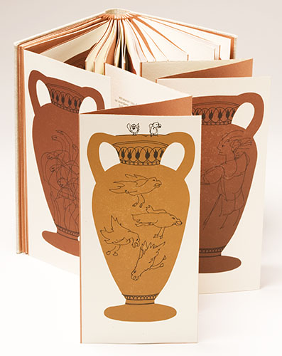
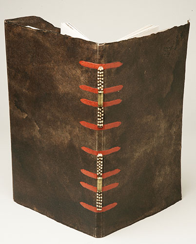
Koch uses the term “photo-interventions” for his digital adaptations of historic images seen in The Lost Journals of Sacajewea, 2010. Sepia tinted, they suggest the ghostly distance of time and shadows of memory.  While Sacajewea’s name may be recognized due to the mythologizing lore of Western adventure, there is little known about this Native American woman, who traveled with the explorer team of Lewis and Clark in 1805.  Debra Magpie Earling, a member of the Confederated Salish and Kootenai Tribes of the Flathead Reservation, who teaches at the University of Montana, lends both poetic voice and prophetic vision to Sacajewea as a pregnant seventeen year old traveling up the Missouri River.  The type is a digital variation selected by Koch for its “retrogressive old-style irregularity.” The binding, designed by Koch, is covered in smoked buffalo rawhide paper by  Amanda Degener and its spine contains trade beads and a small caliber cartridge case—all tactile symbols of encroachment on and the destruction of Native American lands.

Ninja Press, The Real World of Manuel Córdova. Courtesy Carolee Campbell

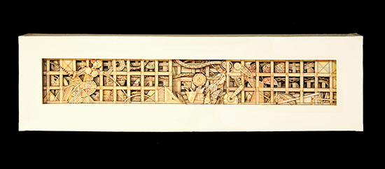
All five presses in The Art of the Book had their genesis in the book-arts renaissance that was primarily situated in the Bay Area during the 1970s; its history, as the catalogue demonstrates, is broad-based, ranging from letterpress printing in the Gold Rush to the latest digital advances. In Robert Bringhurst’s catalog essay, “What the Ink Sings to the Paper,” he cites a “watershed distinction between these five presses and the many that preceded them. Every printer in this show is deeply familiar with the meditative pleasures of handsetting metal type, but each has lived some decades in the digital age and felt the changes it is bringing.” They may veer into the genre of artists’ books, use digital processes, or expand the very nature of the book into performance and installation. At the same time, these versatile designer/printer/ proprietors use fine press techniques that lend unparalleled sensual appeal and clarity of design to their exquisite books.  It is a steadfast tradition documented by Special Col.  The hybrid books in The Art of the Book are fresh inflections of the “book beautiful” tradition that William Morris launched in reaction to the revolution of his own day: the Industrial Revolution. 

Rebound: A Survey of Contemporary California Artist’s Books @ Sonoma Valley Museum of  Art

Rebound is a potpourri of an exhibition with singular delights and unbound categories, ranging from fine press books with a hand-made appearance to one-of-a-kind book objects. In contrast to the Stanford exhibitions, most examples privilege the artist’s vision in their creation. The exhibition is a counterpoint to Sonoma’s concurrent traveling exhibition curated by Robert Flynn Johnson, Six Fairy Tales from the Brothers Grimm, by Britain’s great art star David Hockney. It focuses on the 39 etchings that accompanied a deluxe, limited edition of the fine press book of the same name published by Petersburg Press in 1970. In Hockney’s reach to evoke the dark magic of his first readings, he instilled a mood to placate any contemporary Goth. And there’s a bit of wit, too, to match the artist’s view that narratives of scary fairy tales are really quite outlandish. There is the enchantress, who is bit of a thorny old crone, and there is the man who tore himself apart, an unusual feat without a tweet. 

Dominic Di Mare, "Rendezvous", 2006, watercolor, ink, cutouts


In Rebound, first-time curator Simon Blattner has done well to include Hockney’s 1963 livre d’artiste entitled Rake’s Progress. Based, in part, on William Hogarth’s prints of the same title, it narrates intensely autobiographical events through Hockney’s quasi-primitive pop pictures as a cautionary tale without text. Other highlights include Chris Burden’s diaristic Coyote Stories (2005); Bettina Pauley’s sculptural book objects; Kali-fornia Dreamin (2006), by William Wiley with its 40 buttons printed by Magnolia Editions; and four unique artist books in pristine watercolor by Dominic Di Mare.

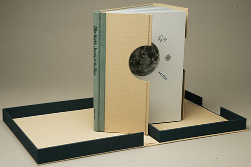
Di Mare’s Paris (2003), whose vellum-like pages evoke intricate, vertical stained glass windows, is a serial meditation in black and white on linear and geometric form.  In contrast, Rendezvous is far more spare.  Here a metamorphosis occurs in abstract figurative elements, which are meticulously formed by tiny dots. Di Mare’s books have an almost musical progression and in Trip (2006) there is an initial sweetness to the tempo that builds up to a crescendo.  Curator Simon Blattner offers a suggestion for viewing Di Mare’s books: “Muse to yourself how long this work might have taken to complete and how rigorous is the process. This could only have been done by and through the total concentration of an artist who knows that he can make time stand still.” Part of the enchantment of Di Mare’s books comes from the tiny geometric, peep holes that reveal enticing clues to the configurations on the next page.  An associated, multi-layered book object, Rendezvous (2010), reveals a similar kind of exquisite surgery.  The museum has mounted some books with second pages in view through their Plexiglas supports, a good solution to the age-old dilemma in presenting book exhibitions in which only one page is visible, and in the case of Di Mare’s books, we may test how true our expectations have been.  That desire to discover what is concealed is, in fact, part of the great intrigue of book exhibitions.   

–SIGNE MAYFIELD


The Art of the Book in California: Five Contemporary Presses and Illustrated Title Pages: 1500-1900 @ Cantor Art Center through August 28, 2011

Rebound: A Survey of Contemporary California Artist’s Books and  Six Fairy Tales from the Brothers Grimm @ Sonoma Valley Museum of Art through August 28, 2011
 
About the Author
Independent Curator Signe Mayfield served as Curator at the Palo Alto Art Center from 1989 to 2011.  There, she mounted exhibitions featuring the art and collections of the San Francisco Bay Area, ranging from Nathan Oliveira: The Painter’s Bronzes to Windows to the Mind: Selected Books from Stanford Special Collections.


Like what you read on Squarecylinder?


Filed Under: Reviews, Special Reports

Primary Sidebar

© 2025 Squarecylinder.com – Art Reviews | Art Museums | Art Gallery Listings Northern California.

Email Subscription Request

You will receive a verification message once you submit this form.

Subscribe to Squarecylinder. It’s Free!