by David M. Roth

Kathy Butterly has long held that smaller is better, and in ColorForm, her first career retrospective, she proves it with a dazzling display of more than 50 tabletop works (none taller than nine inches) that, together, affirm her position in the front rank of ceramic sculpture.
Like her early mentors, Voila Frey and Robert Arneson, Butterly has managed to shatter, perhaps once and for all, the physical and conceptual barriers separating sculpture from painting. She fuses the two so seamlessly that the glazed parts of her works have been favorably compared to the paintings of Mary Heilmann, Amy Sillman, Charline von Heyl, Helen Frankenthaler and Thomas Nozkowski — something that would have never happened a generation ago. Such comparisons, which barely hint at Butterly’s unique contributions, stand as a measure of the distance ceramic sculpture has traveled since the days when practitioners fought to be recognized as artists rather than makers of plates, bowls and teacups.
In this regard, the show’s appearance at the Manetti Shrem Museum of Art on the UC Davis campus couldn’t be more fitting. The artist earned her MFA at UCD in 1990. But, contrary to 
The exhibition, designed by Butterly’s husband, the painter Tom Burckhardt, is lit almost like a surgical theater. In any other context, this would be off-putting. Here, it’s a necessity, as each of these compact, heavily worked objects is so laden with visual incident that anything less would be inadequate. The downside is that you can quickly exhaust yourself cataloging all the

nuances of shape, line, color and texture that Butterly summons to accessorize these objects. Fifty-five of them, from 1989 to the present, are arranged in reverse chronological order on six thigh-high tables and seven wall-mounted shelves, all of them low enough to afford interior views that call to mind human anatomy seen from the inside.
Each begins life as a cast vessel and alludes, in equal measure, to things biomorphic and anthropomorphic. And while no two are alike, they share a common aesthetic, which for lack of a better term I’ll call polymorphous perverse, that being Freud’s nomenclature for nonconforming sexual fixations. Nowhere is it expressed better than in Like Butter (1997) wherein the head of a penis (about the size of a pencil eraser) pokes through a pair of bulging pink thighs, bent at the knees and dissolving into a puddle at the base. It was made, the artist said, to commemorate the relationship she forged with her husband, which began, as many relationships do, with intense physical attraction and with apparent ease, as the title –literalized by bits of ceramic “butter” perched on the rim — suggests. Like much else in the exhibit, it resembles a collection of misaligned body parts, which you can take either as complicated sex 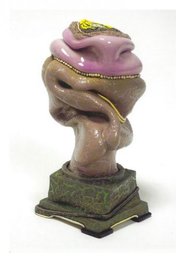
Other works, like Why Not Knot (2005), made in the wake of court decisions legalizing same-sex marriage, are political statements. Its focal point is a finger-like protrusion encircled by a wedding band whose gold tendrils enclose a flesh-colored vessel out of which maple-colored cake “frosting” appears to spill — a reference, perhaps, to the pleasures (or perils) of domesticity. Heavy Head (2003), made after 9/11, is a big drooping bulb attached to a salmon-pink “neck.” It topples over as if stricken, reflecting how the artist (and so many Americans) felt after the attack.
Shapes such as these only partially define the content of Butterly’s art; color and texture are what give it emotional heft, enabling her to express vulnerability, strength and humor all in the same package. Two practices in particular – a pervasive use of pink and the repeated use of vessels resembling women’s handbags – imbue each work with a distinct female identity. What 
The “generic” cast forms, Butterly explained to Nadel, function “sort of like a three-dimensional Rorschachs.” Out of them, “I enable the piece to become what it wants to be” using a “mass of color so thick that it becomes a form unto itself,” something akin to “the antagonist in the piece.” Hence, the title ColorForm.
Blue Crawl, (2007), for example, is a marbleized dome shape riddled with pink craquelure and topped with a “cap” that looks like it was made of cowhide. Resting atop it are a bright yellow “sponge” and an enormous pink “tongue,” the verisimilitude of which brings to mind the trompe-l’oeil effects conjured by Marilyn Levine (1935-2005). Whale Burger (2008), another tongue shape, is molded in the shape of a whale’s head. The structure, laid out horizontally looks as if it had been extruded volcanically from its upended pedestal, the extreme craquelure of it being but one of several elements that sustain that impression. Line Dance (2012), a cup ornamented with mauve ruffles, lends credence to the cliché about sculpture being “drawing in space.” The lines may evoke a Victorian-era petticoat, but the rhythms exude rambunctious, irrepressible energy. The Weight of Color (2015), another open-at-top “handbag,” carries, at its sides, waterfall-like spills of multi-colored pebbles that make it appear as if a geological process had mysteriously intersected with an unsuspecting object.
Butterly’s skills as a colorist hit a peak in a series of 16 nail polish drawings executed on pages of her own exhibition catalogs. Each is a stunner. The artist treats nail polish like watercolor, but the effects more closely resemble a combination of spun smoke and liquified marble, aligning them with “Flow Painting,” a term the LA critic Peter Frank coined to denote
Ironically, when Butterly began studying art, she intended to become a painter. It didn’t click. A visit from Viola Frey to Moore College of Art and Design in Philadelphia, where she was then studying did, and it proved life-changing. As the artist explained to Faye Hirsch in 2015, Frey “gave a demonstration in which she took a big hunk of clay, 25 pounds, and whomped it down on the wheel. Her whole body started swaying as she threw a giant base. And then she started talking. She was political, strong-willed, feminist – awesome…A lightbulb went off: “Oh, ceramics!” Other influential encounters with Arneson, Price and Nagle soon followed. Butterly later enrolled at UC Davis and began working directly with Arenson. At the time, she was making large pieces with lots of carved imagery but also experimenting with smaller works,

which she kept hidden. Arenson accidentally discovered one of them and said, “This is powerful. This is what you’re all about.” After a spell, she came to agree with his assessment. “What I found was I felt like I was illustrating my ideas rather than the piece being the real deal. I don't want to illustrate anything. I don't want to tell stories. I want the piece to be the story,” the artist told Nadel. “What I did was reach into these large forms and pull out the heart.”
“Art,” she maintains, “is how you live your life. And what you make is an extension of who you are and your experiences.”
# # #
Kathy Butterly: “ColorForm” @ Manetti Shrem Museum of Art through December 29, 2019. The artist will be in conversation with Vincent Fecteau on September 25 at CCA Oakland, Nahl Hall @ 7:30 p.m. and @ Manetti Shrem on September 26 with curator Jenelle Porter @ 6 p.m.
About the author:
David M. Roth is the editor and publisher of Squarecylinder.
Another wonderful review! Many thanks. Sandra Shannonhouse